Hospital Wayfinding: Visual communication for Great Patient Care

Enhancing patient experience is a goal of any good hospital--certainly close in ranking to providing excellent care--and the correct hospital sign system is a key component of achieving it.
Wayfinding, the systematic approach to guiding visitors and workers through a facility, relies on signs and other visual clues to provide the most efficient method of directing traffic and action. Hospital wayfinding is an excellent example of why durable, clear signage that speaks to both employees and visitors is necessary; when minutes matter, clear direction is non-negotiable. The addition of new wings, expansion or change in location of a department, these are all common occurrences for growing hospitals, and your hospital's sign system needs to expand-and evolve--as it does.
How Much Difference Does Clear Signage Make?
One study looked at five variables involved in hospital wayfinding and the effect that three different hospital sign system designs had on them. One group's signs used color and clear graphics and showed significantly better outcomes which EEG monitoring attributed to neural signals involving those factors. (The other groups' signage was a standard system, and a color-enhanced only one, respectively.) What were the results?
The biggest takeaway was an increased likelihood of correct initial decision making. The color and graphics group looked at the signs longer but made the correct decision about the direction they were traveling more frequently than the other groups. Even if the misreading of a sign in hospital wayfinding only causes a detour of a few minutes (something the study showed with the other groups), the psychological effect of that feeling of confusion can hinder the patient experience. The evidence suggests that including graphics with color and words causes the brain to engage for a slightly longer period but provides better information. When moments matter, that's valuable.
Another study found that during an emergency, reliance on sight clues is heightened, bolstering the need for vibrant, clear graphics and color use in a hospital wayfinding system.
Who Is Reading It?
Hospital wayfinding addresses numerous people that can be categorized into three main groups. Each has their own unique reasons for needing direction, and each has factors influencing why the hospital sign system guiding them needs to be clear and understood quickly.
- Visitors. Non-patient visitors can be anyone from family or friends seeing a loved one, to contractors or delivery personnel. Easily understood signage gets their job done or their trip to the cafeteria accomplished without stress.
- Staff. Doctors and nurses handle a lot of patient care, and support staff have a big job handling all the tasks involved with a hospital environment. When you add in long hours--and interns and residents who are new and unfamiliar with the facility--clear hospital wayfinding takes one thing off minds occupied with patient care.
- Patients. The reason hospitals exist is to provide care to those who need it. A clear hospital wayfinding system can assist with everything from guiding a new patient through a large campus to providing procedural instructions in individual departments. Staff are often pulled in many directions, and a good, clear hospital sign system can act as an employee would-an employee that is always at the desk, always there to answer questions, and always making the experience easier.
Why Change an Existing System?
If it isn't broken, why fix it? In some cases, you may not realize your hospital wayfinding system isn't helpful unless complaints or mistakes begin to pile up. If research about productivity isn't conducted, bad results aren't discovered. Even if there aren't any glitches in your current operations, there are good reasons to update.
- Continual Improvement. The application of the business model of Kaizen, the Japanese practice of ongoing evaluation and evolution, is an effective way of continuing to expand the level of care you give to patients. In the same way that science continually discovers new treatments and practices, hospitals need to seek ways to make the process of receiving those treatments as seamless as possible. Even if your system is solid, the materials used can deteriorate over time and need replacing. The printing methods and materials used for a hospital wayfinding system are just as important as the layout; an industrial printer using high quality supplies and an ink (such as resin) that's designed for high use and is moisture and chemical resistant is an appropriate choice for the type of wear and tear a hospital's floors typically see.
- Surge Preparation. COVID-19 is an example of an unexpected surge (one that required its own specialized signage, from quarantine signs to social distancing markers). Other emergencies can flood hospitals at any time, requiring even more of a hospital sign system. Clear direction becomes critical when a facility is crowded, or typical operations become strained.
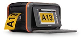
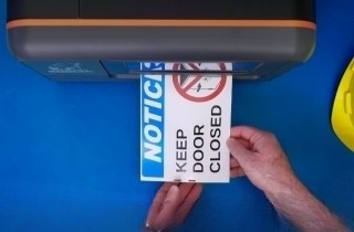
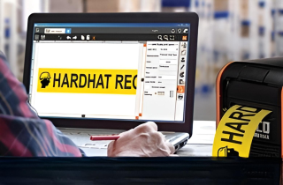
If you're evaluating your hospital wayfinding system you want to ensure that you acquire the means to produce your own signage and floor markings, and use the highest quality materials and software, allowing for individualization and changes in need. Visit our library of articles, webinars, and other resources to find information on the types of wayfinding signs, as well as other hospital safety labeling guidance.
Related Resources

Lean Healthcare: Focusing on Quality and Safety
Lean Healthcare Quality and Safety Healthcare professionals have a long history of caring for their patients ...
Read
CMMS and Safety in the Workplace
Manufacturing and other industries are harnessing the power of CMMS for maintenance efficiency and safety. ...
Read
2 Essential Lean Tools for Establishing New Facilities
Mitigate disruptions and build for the future using a thorough 5S plan from top to bottom. Focus on securing ...
Read.png)


%20(1).webp)
