5 Safety Signage Tips That Support OSHA Aviation Regulations

Why Do OSHA Aviation Regulations Matter for Safety Signage in Aviation Facilities?
Occupational Health and Safety Administration (OSHA) aviation regulations matter for signage because aviation facilities have high-risk hazards and tight operational margins. Clear aviation safety signs and labels keep workers out of danger zones, guide safe movement around aircraft and equipment, and support consistent procedures across shifts. Strong signage also helps facilities meet audit expectations and avoid preventable incidents.
The sections below outline what aviation facilities need from safety signage and the five practices that keep it effective.
-
The biggest signage risks in aviation facilities
-
Where aviation safety signs matter most on site
-
How to keep labels visible in high-traffic zones
-
Material and durability choices for aviation environments
-
Five best practices for compliant aviation facility safety
Ensuring the safety and efficiency of an aviation facility relies heavily on the quality and effectiveness of its safety labels and signs. Operations Managers, Safety Managers, and Facility Managers must consider numerous factors when developing and implementing visual communication aids. Here are 5 best practices for creating and maintaining effective signage in aviation facilities.
1. Follow FAA, ICAO, and OSHA Regulations for Safety Signage
Aviation facility safety depends on signage that stays accurate, visible, and consistent in fast moving work zones. Ensure that all forms of safety signage meet the regulations set by entities such as the Federal Aviation Administration (FAA), International Civil Aviation Organization (ICAO), OSHA and other relevant bodies. This includes adhering to standardized symbols and colors prescribed by these regulatory bodies to ensure uniform understanding among staff and passengers.
Review and update signage regularly to align with any changes or updates in FAA, ICAO, and OSHA regulations. FAA, ICAO, and OSHA standards and guidelines can evolve. Maintaining compliance requires staying informed of the latest requirements. Conduct routine audits of your safety signage to confirm that all visual communications meet current regulatory standards. Any non-compliant safety signs should be promptly replaced or updated to maintain adherence to the prescribed regulations.
2. Keep Safety Signage Clear and Readable
Safety labels and signs must be clear and standardized. Use the symbols and colors dictated by regulatory bodies, like the FAA, to ensure that signs are universally recognizable and easily understood, enhancing overall workplace safety within the facility. Select clear, legible fonts and appropriately sized text that can be read from a distance. Avoid overly decorative fonts that might complicate readability.
High-contrast color combinations are essential, especially in low-light conditions. Ensure that text stands out against the background, always making safety signage easily readable. Keep messages concise and to the point. Avoid cluttering signs with unnecessary information, distracting from the critical message.
Maintain a consistent layout and design language across all forms of visual communication. Consistency builds familiarity and helps users quickly recognize and understand the signs.
3. Place Safety Labels and Signs Where People Look
Visibility is a constant challenge in aviation work zones with rotating crews, moving equipment, and nonstop foot and vehicle traffic. Place safety signs and visual communication aids at key locations, such as entrances, exits, intersections, and areas where specific actions are required. Strategic positioning helps guide traffic flow and prevent confusion. Position signs at eye level and angle them for maximum visibility to the intended audience. This ensures that safety labels and signs are easily seen and read by anyone passing by.
Consider the natural lines of sight when placing signs to ensure they are positioned where people naturally focus their attention. Work safety signs should align with common viewpoints to capture immediate attention. Avoid placing signs in cluttered areas or locations that might obstruct the message. Consistent placement across similar areas can reinforce recognition and understanding. 
4. Know Your Audience
Aviation environments expose signage to jet fuel, UV light, weather, abrasion, and repeated cleaning. Materials have to survive that without peeling or fading. Deploy safety signage that is intuitive and user-friendly, facilitating easy navigation and comprehension.
Aviation facilities typically cater to a diverse population. Including multiple languages on signage helps accommodate non-native speakers and ensures everyone can understand important information. Utilize universally recognized symbols and icons to transcend language barriers. This practice enhances comprehension among international travelers and staff members.
5. Have a Plan, Stick to It
Aviation visual communication works best when it follows a clear plan. A documented approach, informed by job safety analyses and user feedback, keeps aviation safety signs consistent, relevant, and compliant over time. If necessary, complete a job safety analysis (JSA) for each role in your facility, and use that data to inform your safety signs, hazard communication labels, and floor marking layout. Gather feedback from users to identify issues or areas for improvement in the visual communications plan. Engaging with users provides valuable insights into the effectiveness of safety labels and signs.
Periodically review and update the visual communications plan. Adapting to changes in regulations, technology, and facility needs ensures that signage remains effective and up-to-date. This can be added to your routine safety training updates as an opportunity to reinforce adherence to safety best practices.
Effective aviation safety signage support FAA compliance, safety, and operational efficiency. These best practices allow safety professionals to deploy visual communication that is clear, readable, and accessible to all.
DuraLabel Safety Signage Solutions that Align with the FAA
In an aviation facility, safety labels, signs, and floor markings provide increased workplace safety and efficiency of operations. Safety signs typically include warning signs, such as "Caution: Wet Floor" or "Danger: High Voltage," which alert personnel and passengers to potential hazards. Instructional signs, like "Exit" and "Emergency Assembly Point," provide essential directions during emergencies. Labels on containers and equipment, such as those indicating flammable materials or first aid kits, ensure that hazardous substances are properly identified, and safety resources are easily accessible. Floor marking tape is used to delineate specific areas, such as walkways, no-go zones, and vehicle pathways, enhancing the safe movement of people and machinery. Also, floor markings and emergency signs indicating fire escape routes keep workers safe in an evacuation. Together, these visual communications create a comprehensive safety network that helps prevent accidents and ensures a smooth flow of operations.
Select durable signs and labels that can withstand environmental conditions such as UV exposure, weather, and physical wear and tear. This allows for signage to remain legible and effective over time. Establish a regular maintenance and inspection schedule to ensure signs remain in good condition. Promptly address any damage or wear to maintain the integrity of visual communications.
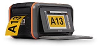
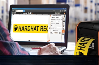
Create clear, compelling custom industrial labels and signs with the DuraLabel Toro Max and Kodiak Max Industrial Sign and Label Print Systems. Both the Toro Max and Kodiak Max are powered by LabelForge PRO, the most advanced industrial labeling software available to the safety industry. LabelForge PRO includes thousands of preloaded, ready-to-print regulatory vinyl labels covering all your compliance, safety, and efficiency needs. LabelForge PRO supports 14 languages making localization a snap.
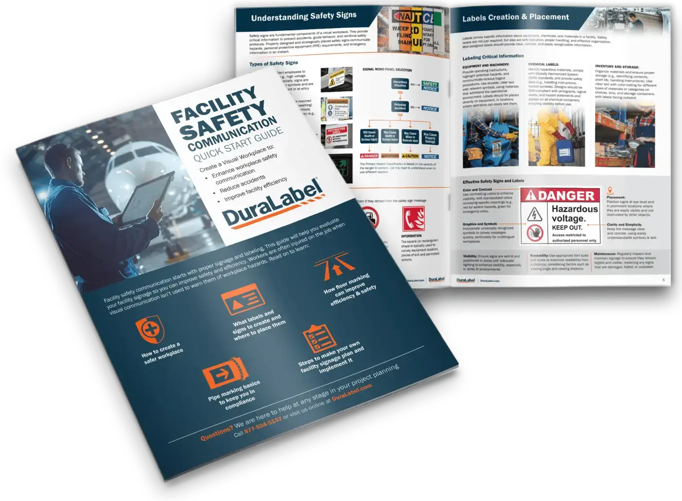
Want to learn more about which signs and labels should be in your facility? Download the free DuraLabel Facility Signage Handbook to discover what is needed for your facility.
No two workplaces are the same, and there is no one-size-fits-all solution. Connect with one of our safety consultants at 1-888-973-2045 to tackle your facility’s unique challenges.
Read Next:
Visual Communication: Critical for Safety and Efficiency in Manufacturing
Overcome Aviation Safety Top Challenges: Runway Safety and Incursions with the FAA
Related Resources

Overcome Aviation Safety Top Challenges: Runway Safety and Incursions with the FAA
What Is the FAA Doing to Improve Runway Safety? The Federal Aviation Administration (FAA) is strengthening ...
Read
How 5 Industries Rely on Custom OSHA Signs to Cut Hazards
How Can Construction Safety Signs Reduce Injury Risks in Fast-Paced Job Sites? Construction safety signs ...
Read
Why Upgrade to the DuraLabel Toro Max Industrial Sign and Label System
Why Would Facilities Upgrade to a Toro Max Printer? Facilities upgrade to the DuraLabel® Toro® Max Industrial ...
Read.png)
